Datalab.
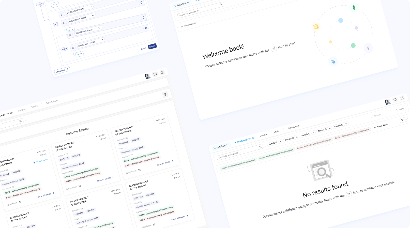
One simple way to search and access key research & innovation data with predictive analytics for all market users.
User research
Introduction to the subject
The project was initiated with an analysis and presentation, by the product owner, of the existing tool that we would be working to improve. However, we needed to get insight directly from the user on how they used the tool in their everyday tasks at work, and what they felt could be improved upon.
This would both allow us to understand the tool better, as well as define the core needs of its users.
User interviews
A round of user interviews were planned and conducted, taking in feedback from every different key user type that used the tool. We planned a list of questions ahead of time, often trying to keep them as open as possible so as not to limit the amount of information we could gain from these responses.
These questions served as a basic guideline but weren’t necessarily something we absolutely had to stick to, as we prioritised letting the interviewee speak freely about their experiences with the tool and giving us as much relevant information as possible.
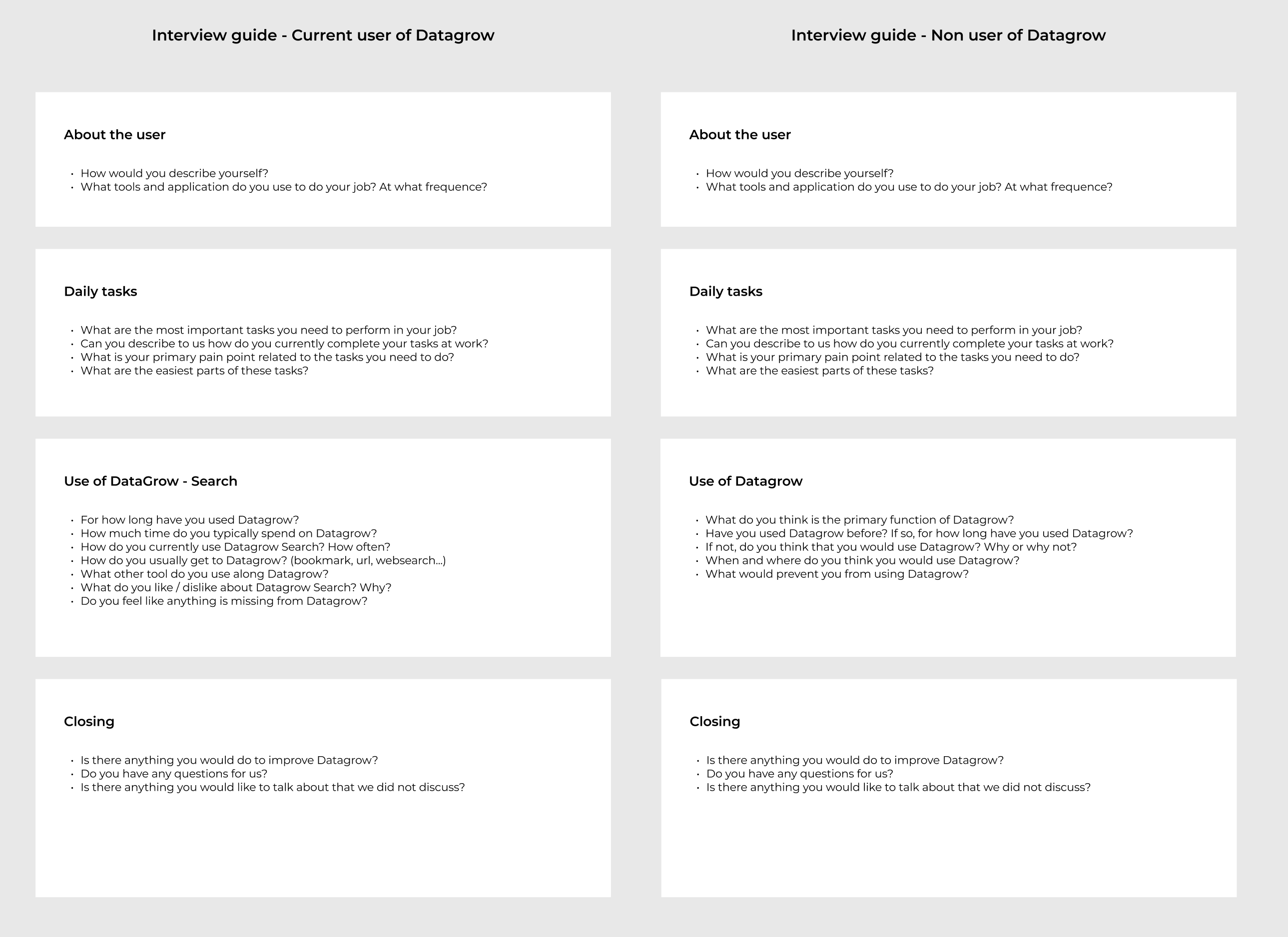
We used Dovetail and Figma to document, create personas, and highlight valuable insights that we would later break down into individual user stories and epics in the Jira backlog. These changes would then be brought through the implementation of new features, and/or a complete overhaul of existing ones.
Key pain points
{{ c.title }}
{{ c.text }}
Design
Benchmarks & wireframes

Starting with wireframes, we began to work on solutions. At this stage we were also conducting benchmarks of other platforms with features that we could learn from, whilst annotating and sharing our research with the product owner who helped us validate or iterate on these initial designs.
High-fidelity prototypes
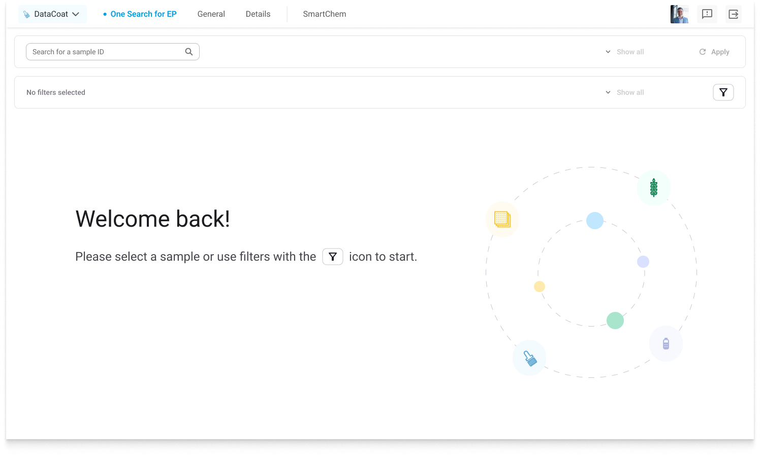
Once validated by the product owner and some key users, we upgraded our wireframes to high-fidelity versions of the final product.
The different screens were animated through Figma’s prototyping tool which allowed us to perform interactive demos and make sure our designs remained consistent with user needs and expectations through the entire design process.
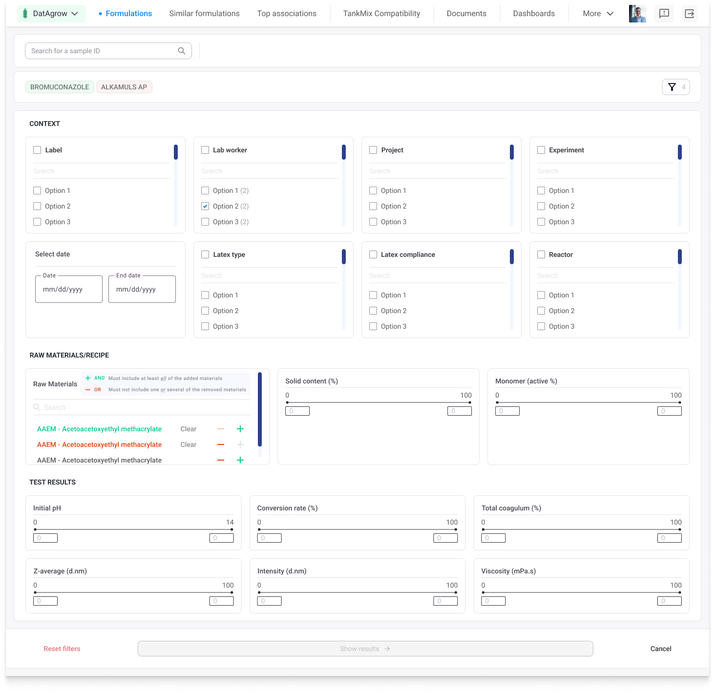
To solve this problem we worked on a full-page customizable filters system. This allows users to have a higher degree of control over their search results, but also frees up space on the search results page by giving them their own space, compared to the old version which featured most of its filters on a lateral menu next to the search results, making the user scroll more to see their data.
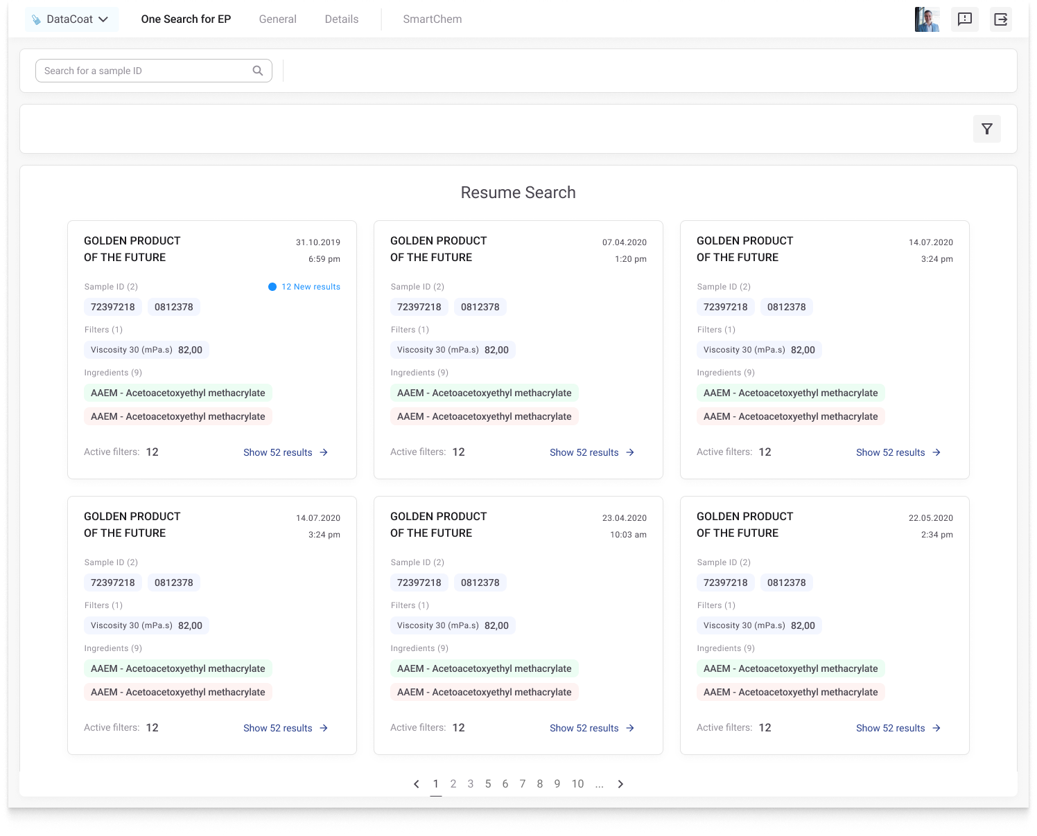
Another pain point highlighted during our user interviews was that it was frustrating to have to restart a new search every time, that they couldn’t go back to a previous set of chosen filters and displayed search results once they had left the app.
To save these filter settings and allow users to quickly go back to a previous search, we designed a search history feature for the home page that would save filter sets.
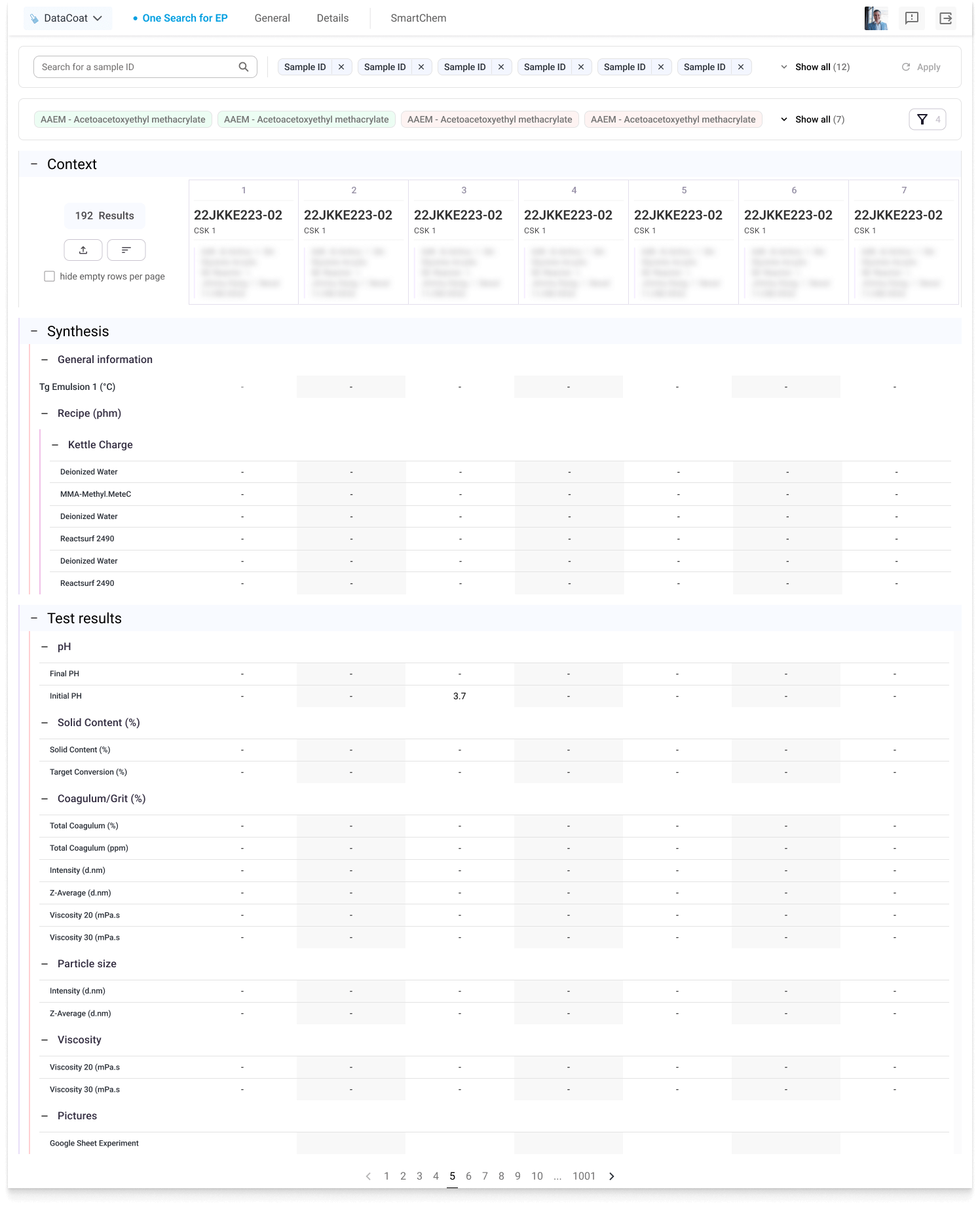
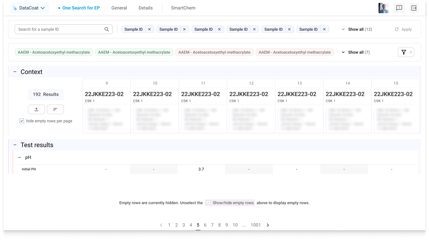
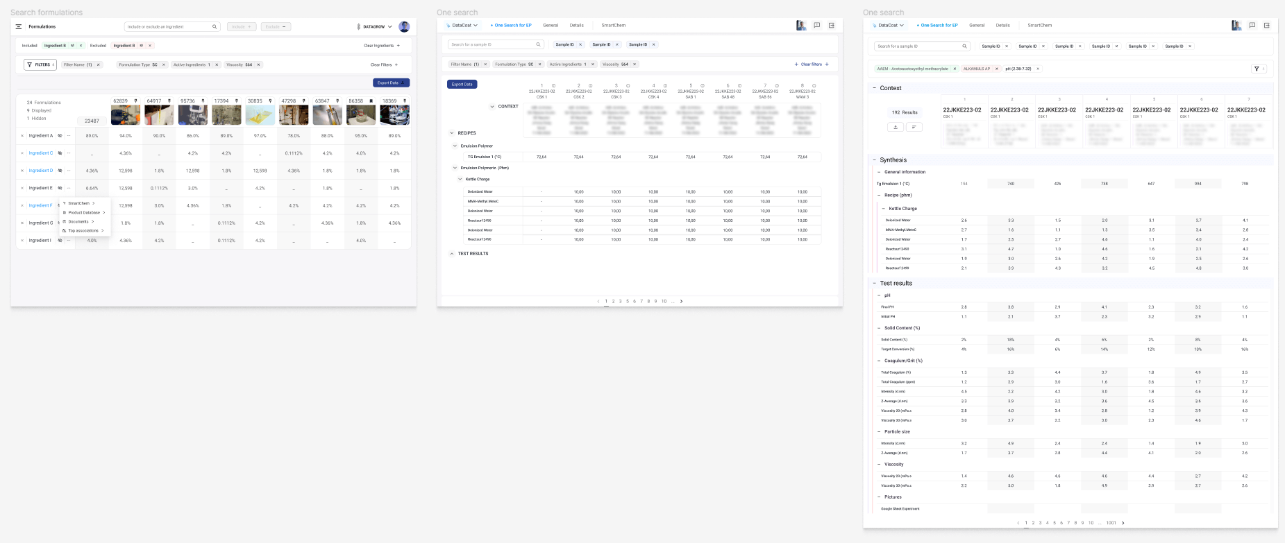
Sometimes, even applying filters, users would be faced with more data than they could easily read to be able to quickly compare different results. To solve this, we tested different ways of displaying the search results and sorting what is being shown.
The search results are broken down into different sections which can be folded or expanded, and the user can select a “hide empty rows” checkbox to quickly refine what is being shown.
This was one of the main objectives we aimed to resolve with the re-work of this web app. The goal is to make it a central hub for data, that will include more and more data from different markets over the years.
At the point of my participation in the project, this was a work in progress.
Testing & iterating
Certain key features went through many iterations as they evolved into the most accurate solution to the problem that we were trying to solve.
Documenting & defining guidelines
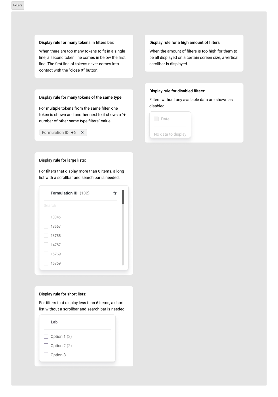
For different components, I spent some time documenting their behaviour and creating guidelines as to when and how they should be used in a UI.
Design system
To build our new web app, I built a Google Material Design–based design system, which I modified to suit our needs, and supplemented with more specific, custom-built components. This design system allowed us to implement new features and build interfaces quickly, applying changes dynamically when needed.
↑ The repo's “design system.png” was overwritten with Louise’s sheet, drop the Material-Design version here and it’ll persist.
Transfer to development
At first, when handing the designs over to the developer team, we would write detailed specifications on every new major component that we introduced. This would include things like hex codes for backgrounds, strokes, padding, margin, and more.
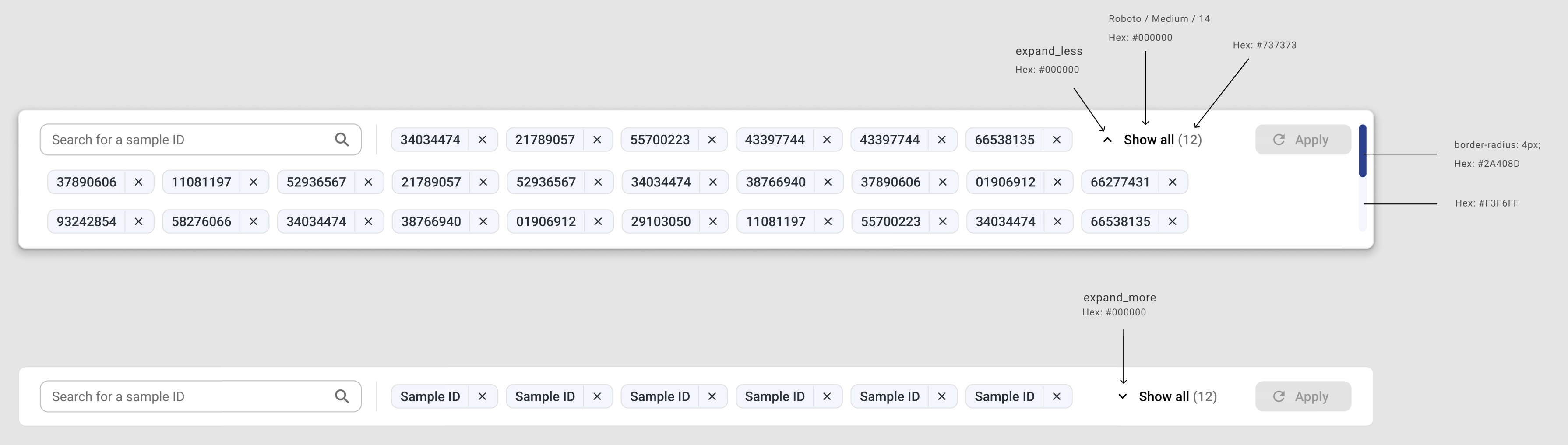
The developers weren’t yet very comfortable with Figma’s old inspect mode and therefore we spent a lot of time going over things like exporting assets and small Figma prototype details.
As soon as Figma’s new dev mode launched I introduced it to the team and put a process in place which helped to refine the developer hand-off process.