Archipel.
As part of the design team, I worked closely with senior designers, developers, the marketing team, and the Product Manager to improve the global user experience across the Archipel apps ecosystem, through user research, data analytics, prototyping, interface design, motion videos, and more.
Improving the invitation feature
Problem statement
This issue aimed at improving the invitation feature encompassed several smaller problems, which gave me the opportunity to become more familiar with the component, learning how it works, how users interact with it, and how it could be further optimised.
{{ c.title }}
{{ c.text }}
Making invitations clearer to the user

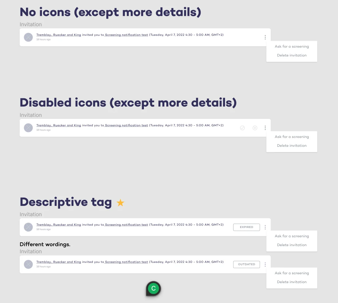
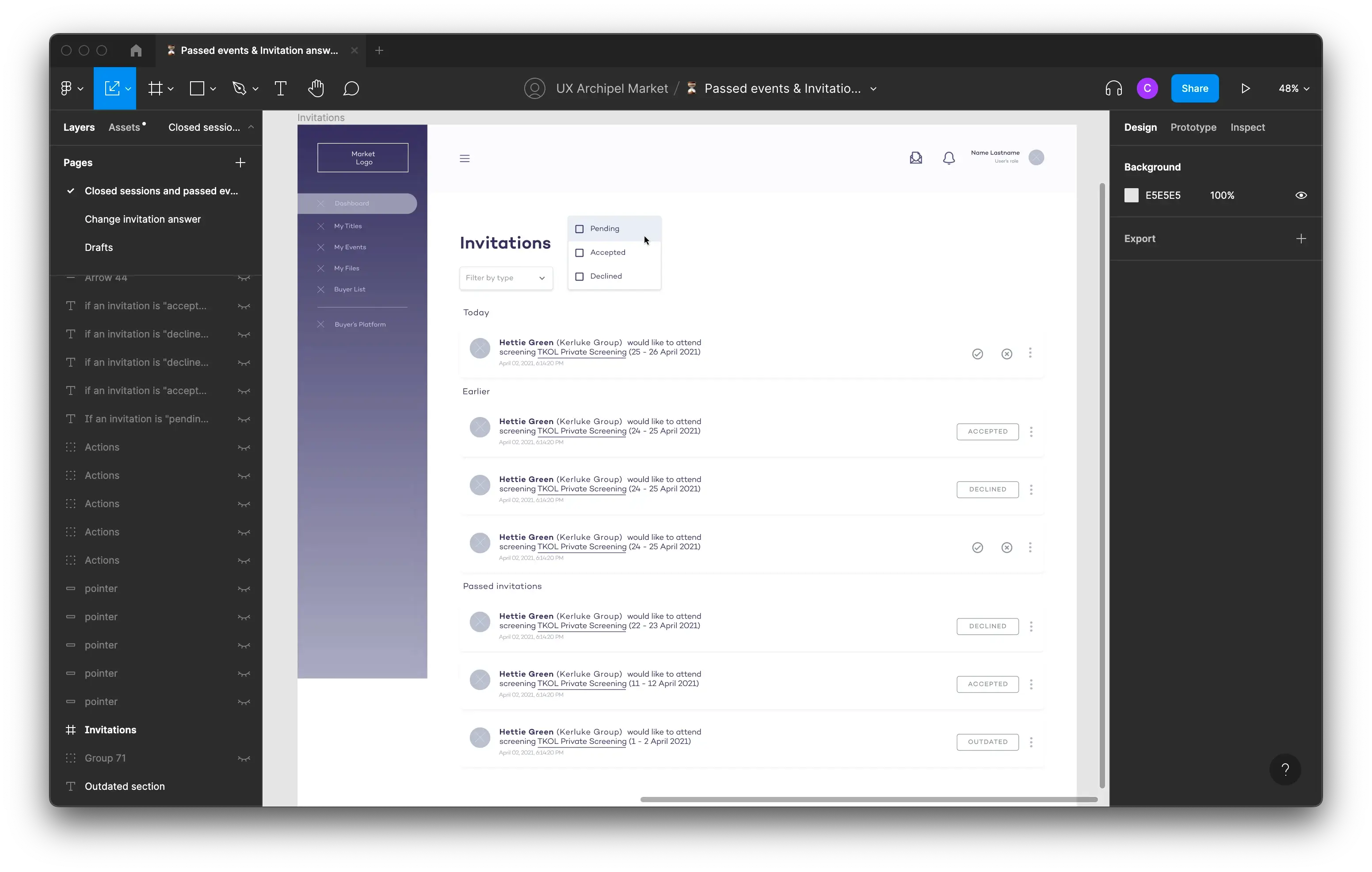
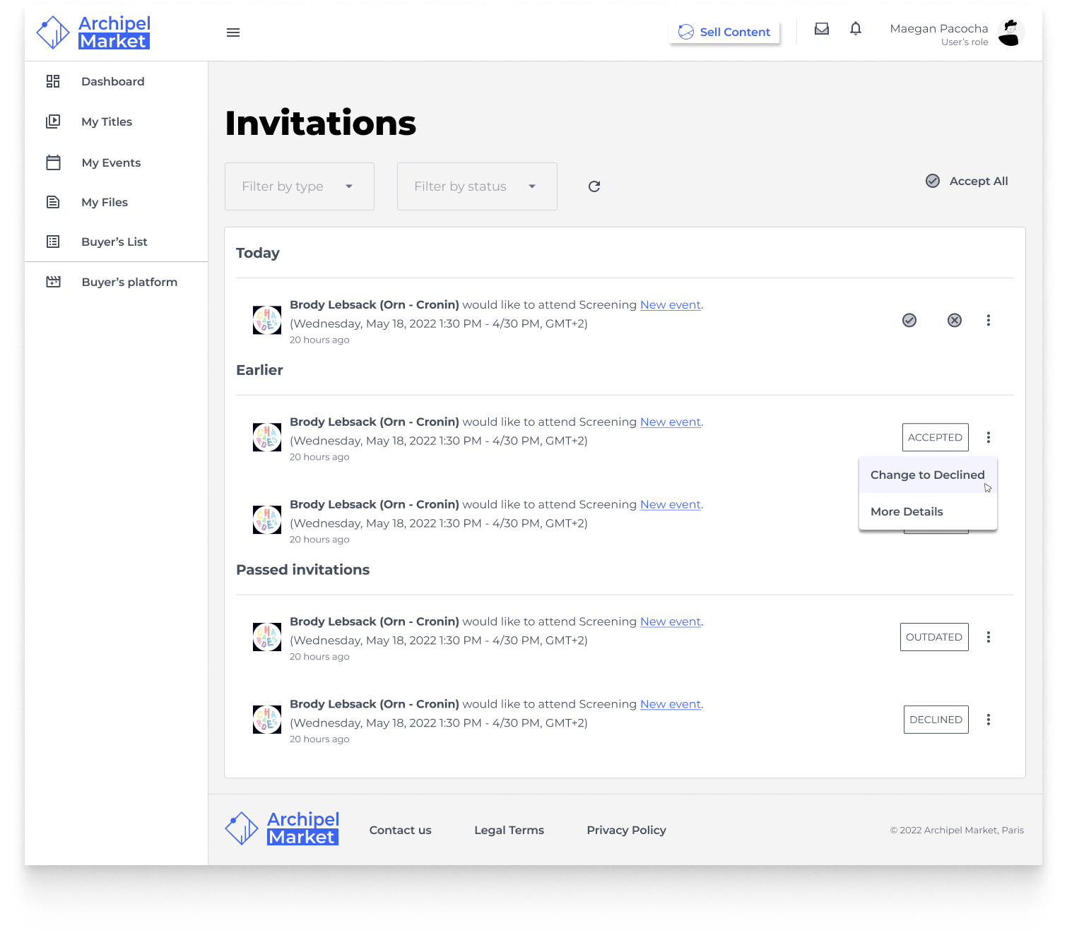
Initially, users could still interact with invitations for events that had already passed, accepting or declining them. This would notify the person who sent the invite, causing unnecessary confusion for both parties.
Proposed solution
To face this first problem, I came up with three potential solutions.
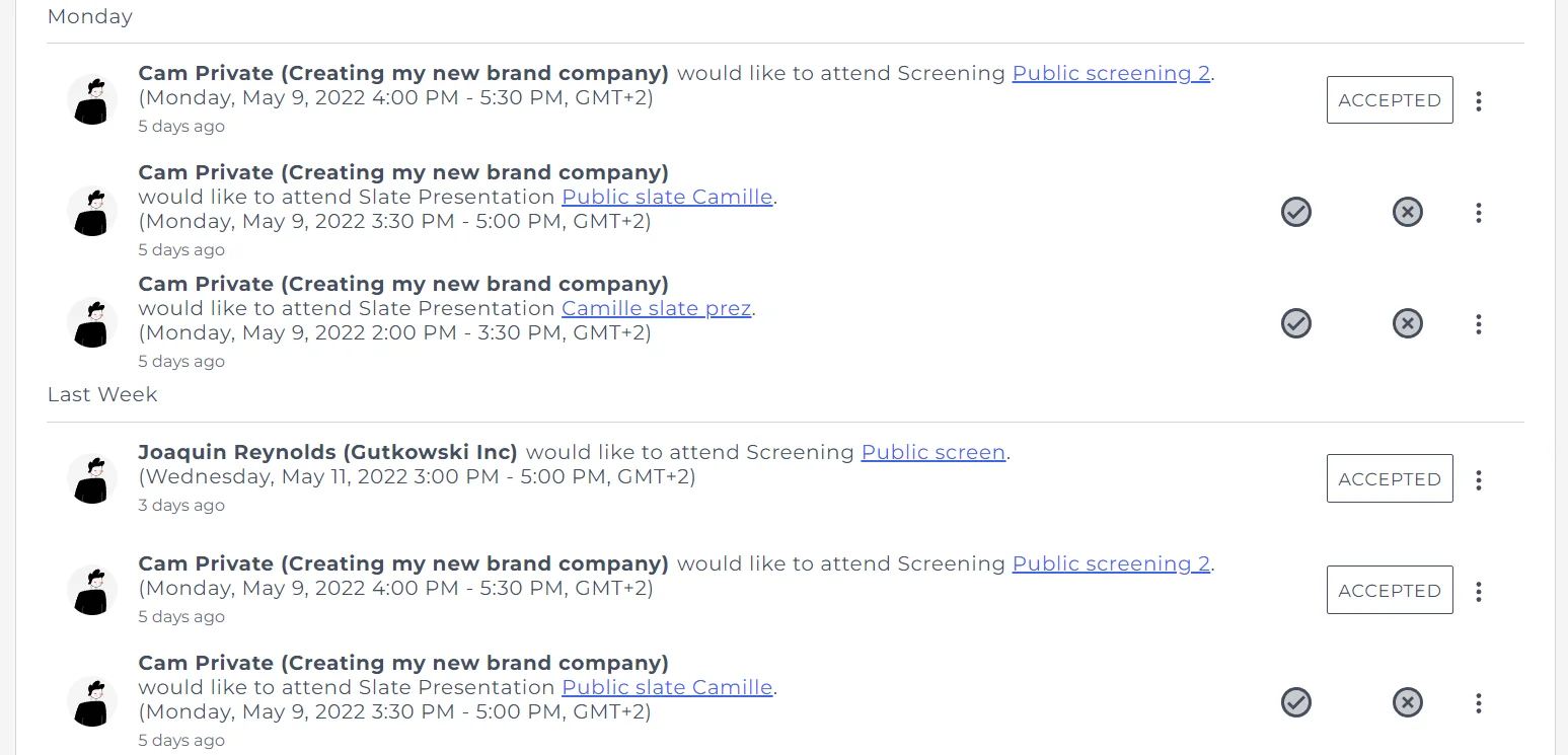
The second problem was that invitations would appear several times in different categories. For example, if sent on a day that had already passed, they would appear in both “Monday” and “Last Week”.
Proposed solution
I suggested and designed the wireframes for a new structure presented as Today; Earlier; Passed Invitations. This prevents invitations from appearing in two places at once, and supports the “expired notification” tag above by automatically sorting passed-event invitations into the appropriate category.
Allow users to change their mind
Users could accept or deny an invitation, but once that choice was made they couldn’t change their input. If a user changed their mind or selected the wrong option by accident, this could be quite frustrating. This issue required a lot of back-and-forth with the devs.
Proposed solutions
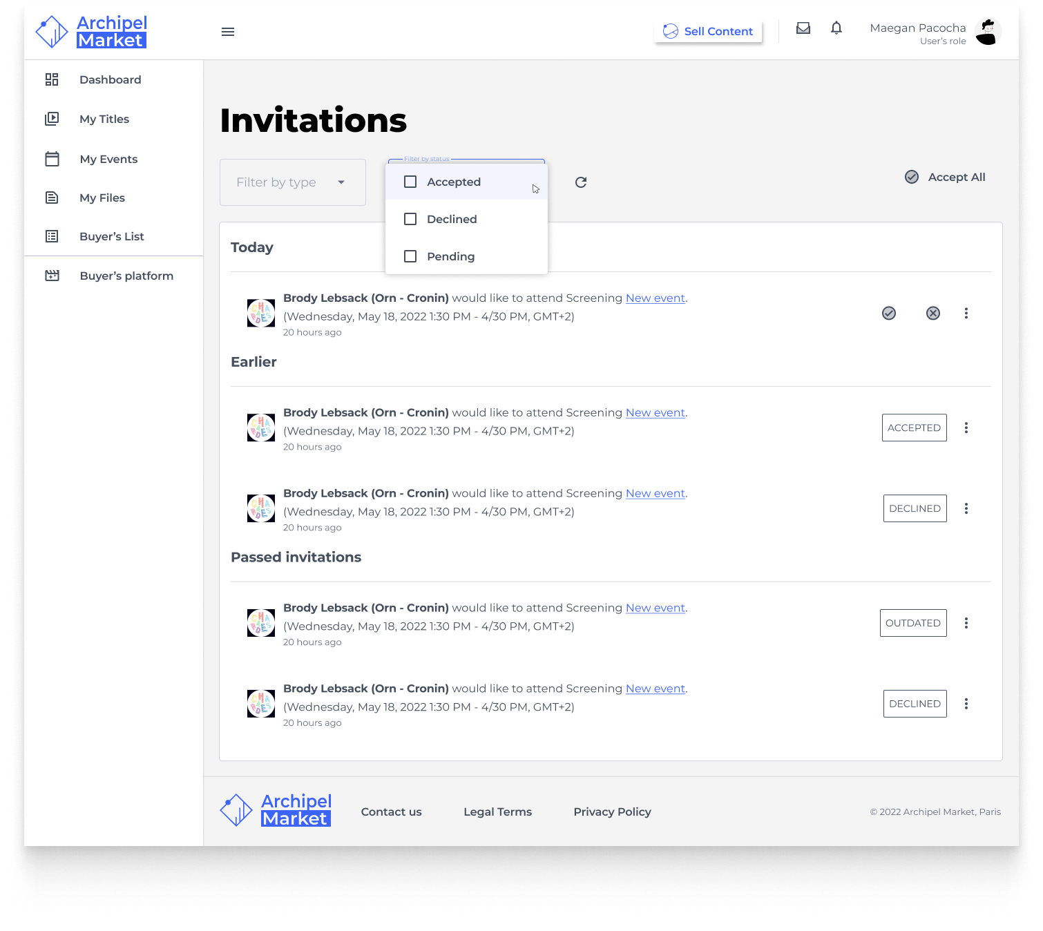
I first came up with a Google Meet–style toggle of “yes” or “no”, a component that already existed in the Angular Material library. Other options: keep the accept/deny icons always visible, open a dropdown to modify the choice, or go into the event page to modify it there.
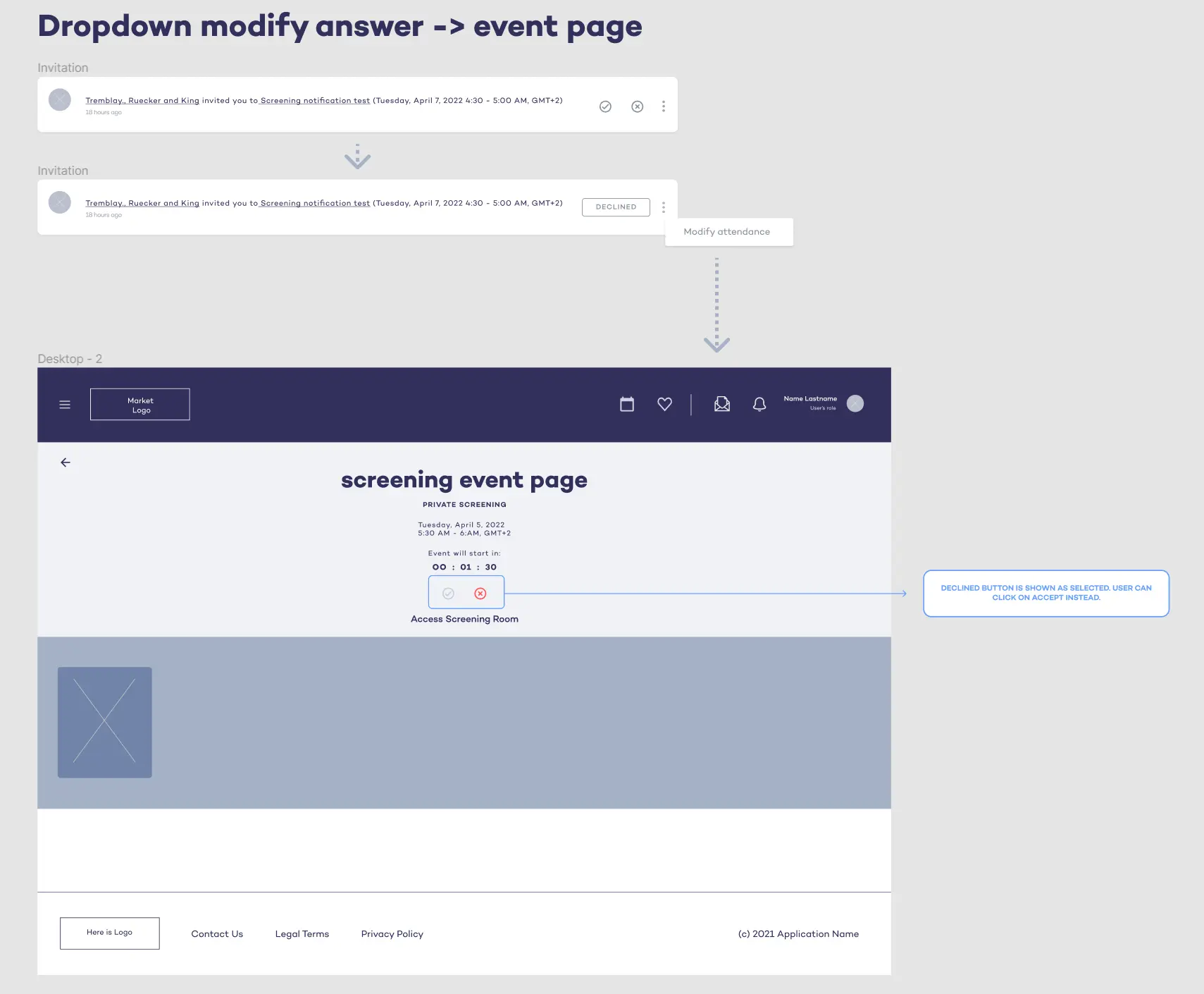
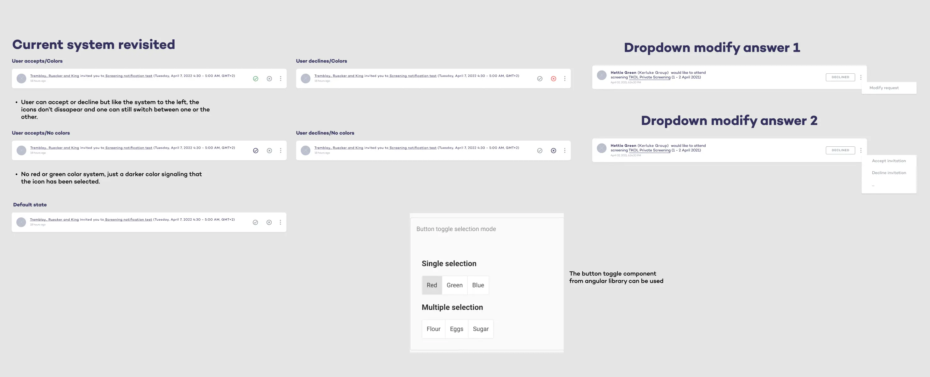
One issue: as soon as the change-of-answer option was available, every use sent an extra notification to the event host. So I had to make the feature accessible if needed, yet not so easy or satisfying to use as a single click of a button.
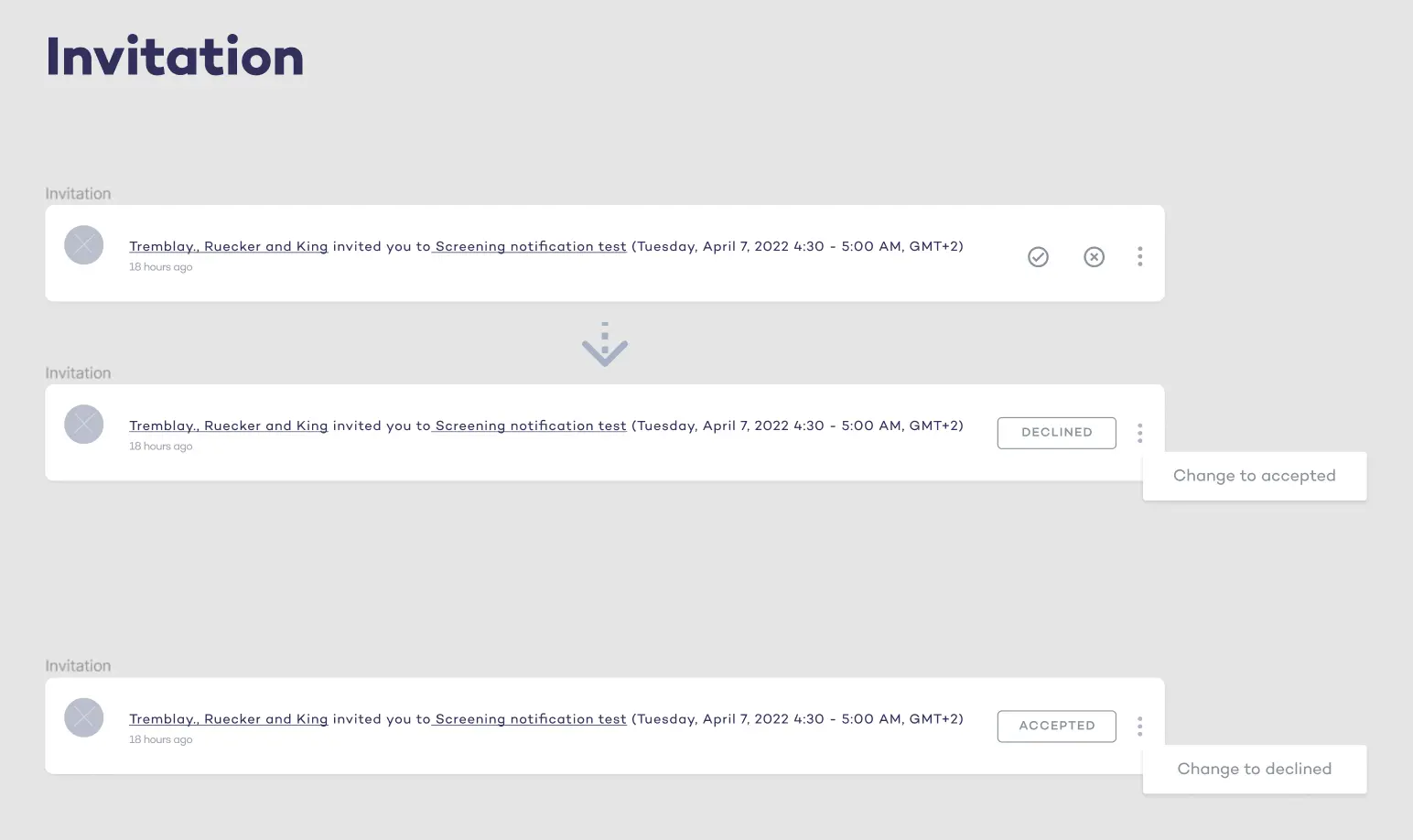
Taking all of the above into account, and having validated the work with the devs, the Lead UX designer and I chose the dropdown-style option. It lets the user change their mind without making it too easy to flip back and forth between accept and decline.
UI adaptation
Once the wireframes were validated by the lead UX designer, devs, and product manager, I moved to the UI phase. Using the design system and pre-established guidelines, I built high-fidelity mockups with Figma’s auto-layout.
Access different collections
Problem statement
On the FilmSeriesNFTs landing page, the Cascade8 collection was the only one available. As more NFT projects arrived, they would all be mixed together in the same space, we wanted distinct sections for each project.
🔖 Lack of organisation
All future projects added to the collection would be mixed up together.
Designing a new Collections page
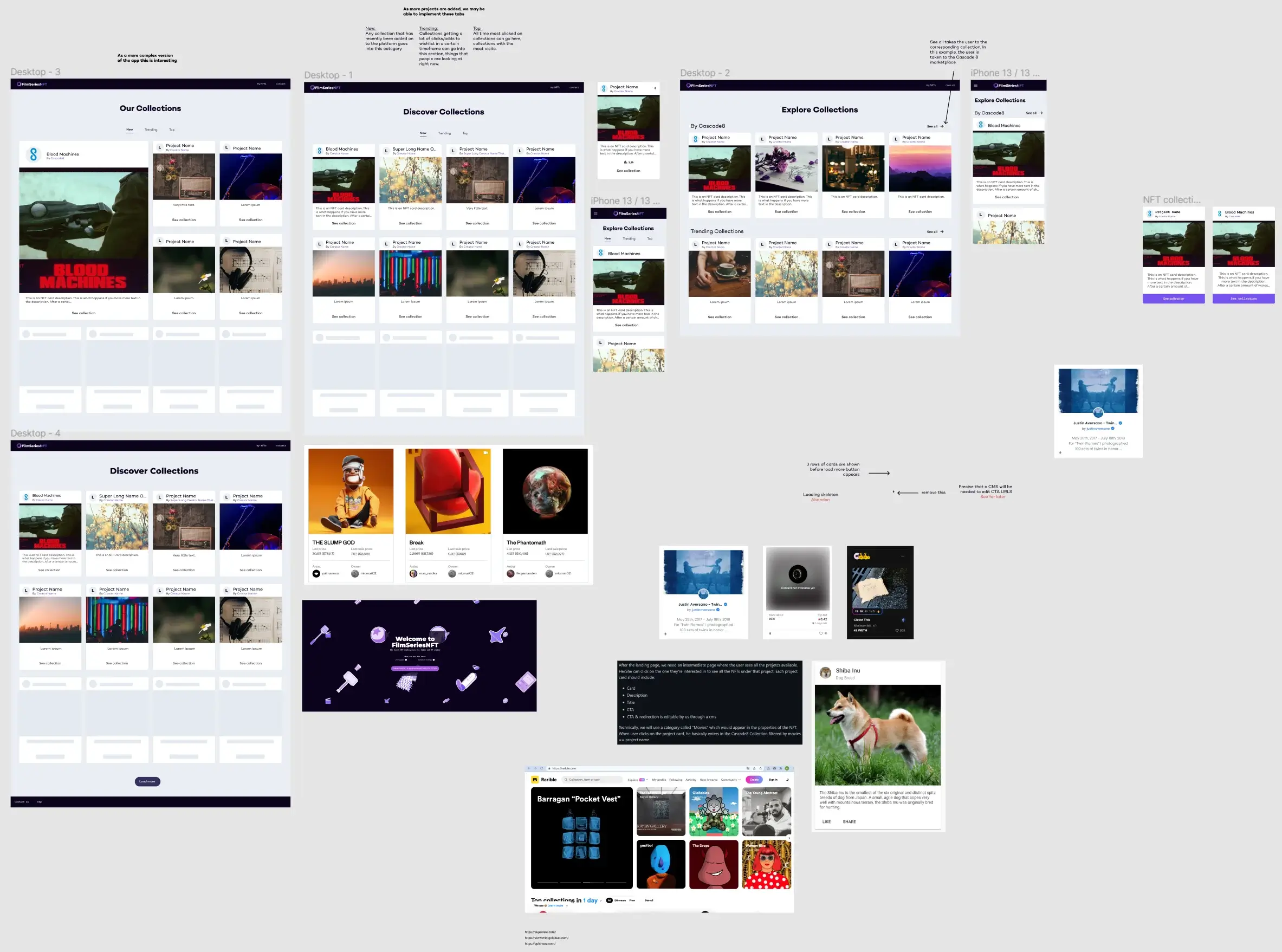
I started by benchmarking other NFT platforms, collecting information and building a moodboard for inspiration. Some basic wireframes were also designed.
Proposed solution
Using the wireframes and the Angular Material library as a reference, so every new component would be easy for the devs to implement, I built this high-fidelity mockup. I also designed a mobile version and an overlay menu for easy navigation.
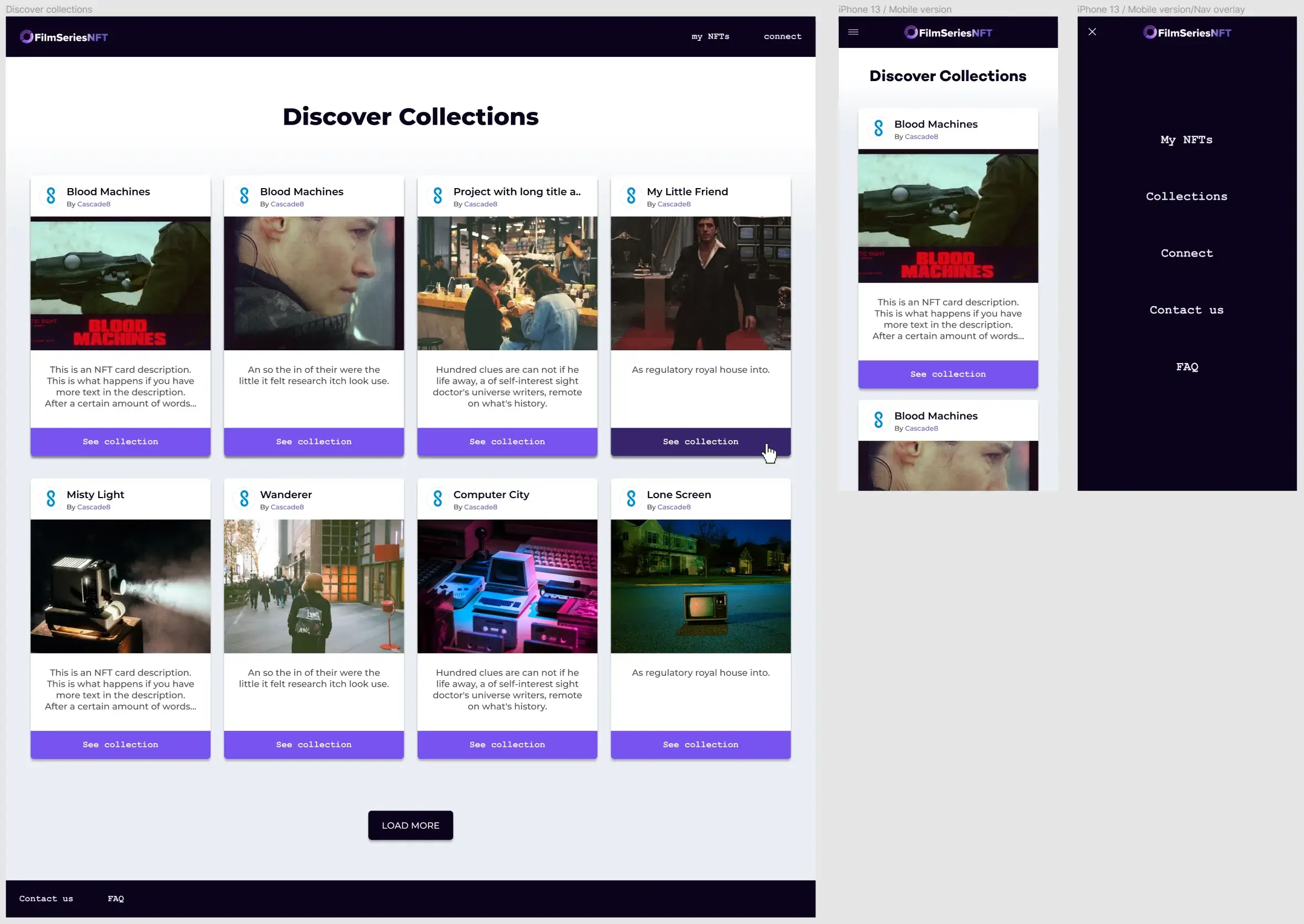
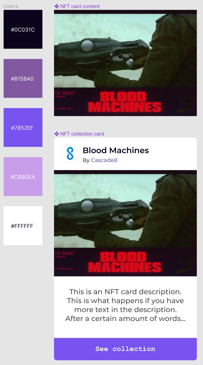
Two new components were built and added to the FilmSeriesNFT design system. This lets us change designs dynamically from a single place.
Enhancing onboarding through callouts
Problem statement
We needed an onboarding solution within the apps to do a better job of explaining important features to new and current users.
{{ c.title }}
{{ c.text }}
Benchmark & wireframes
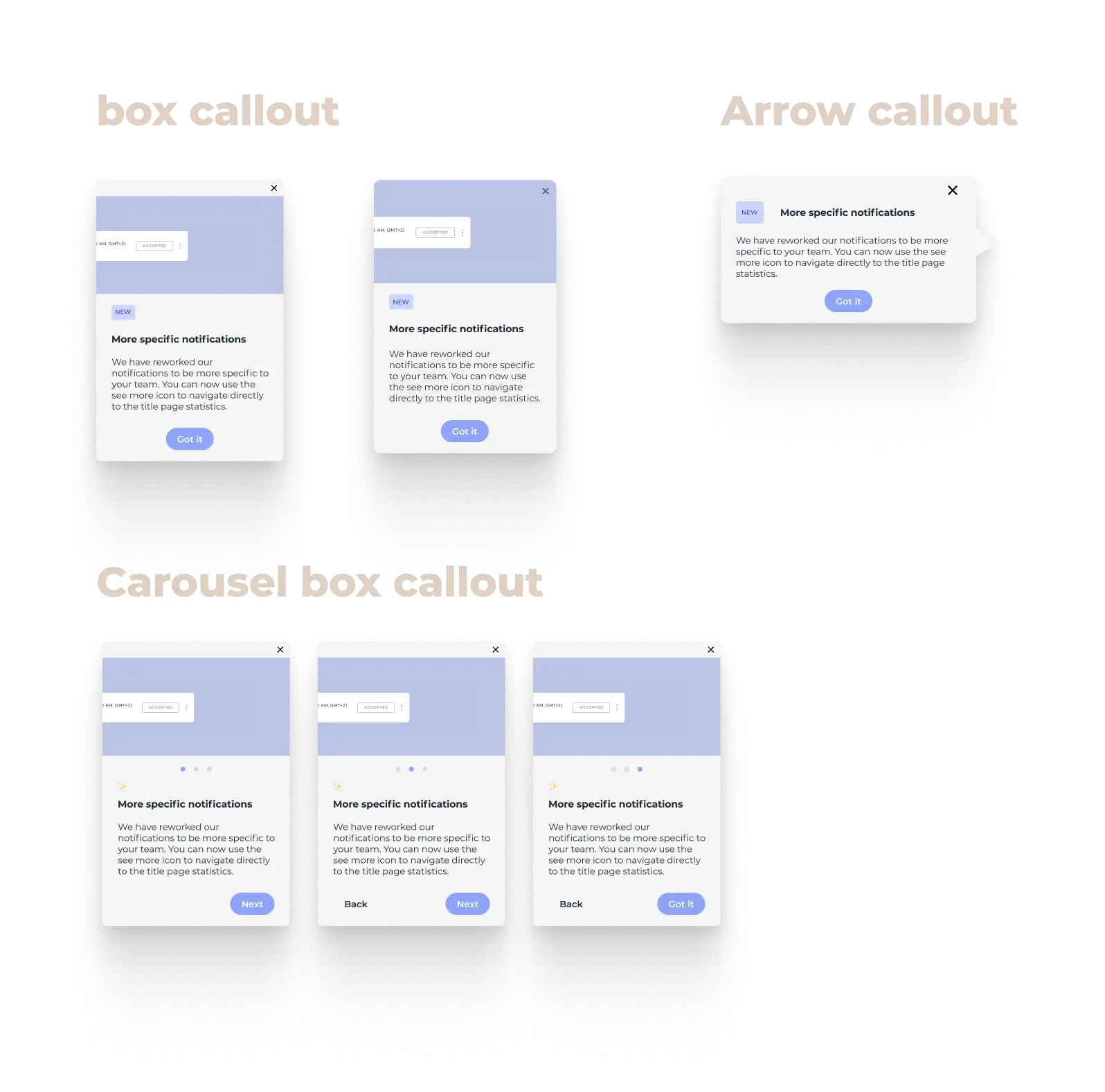
After benchmarking, I started with low-fidelity prototypes for three types of callouts: a standard box callout fixed to the lower-right of the screen (with a content area for images, GIFs and short videos, plus a description and a button); a more area-specific callout pointing to features directly; and a carousel variant of the box type.
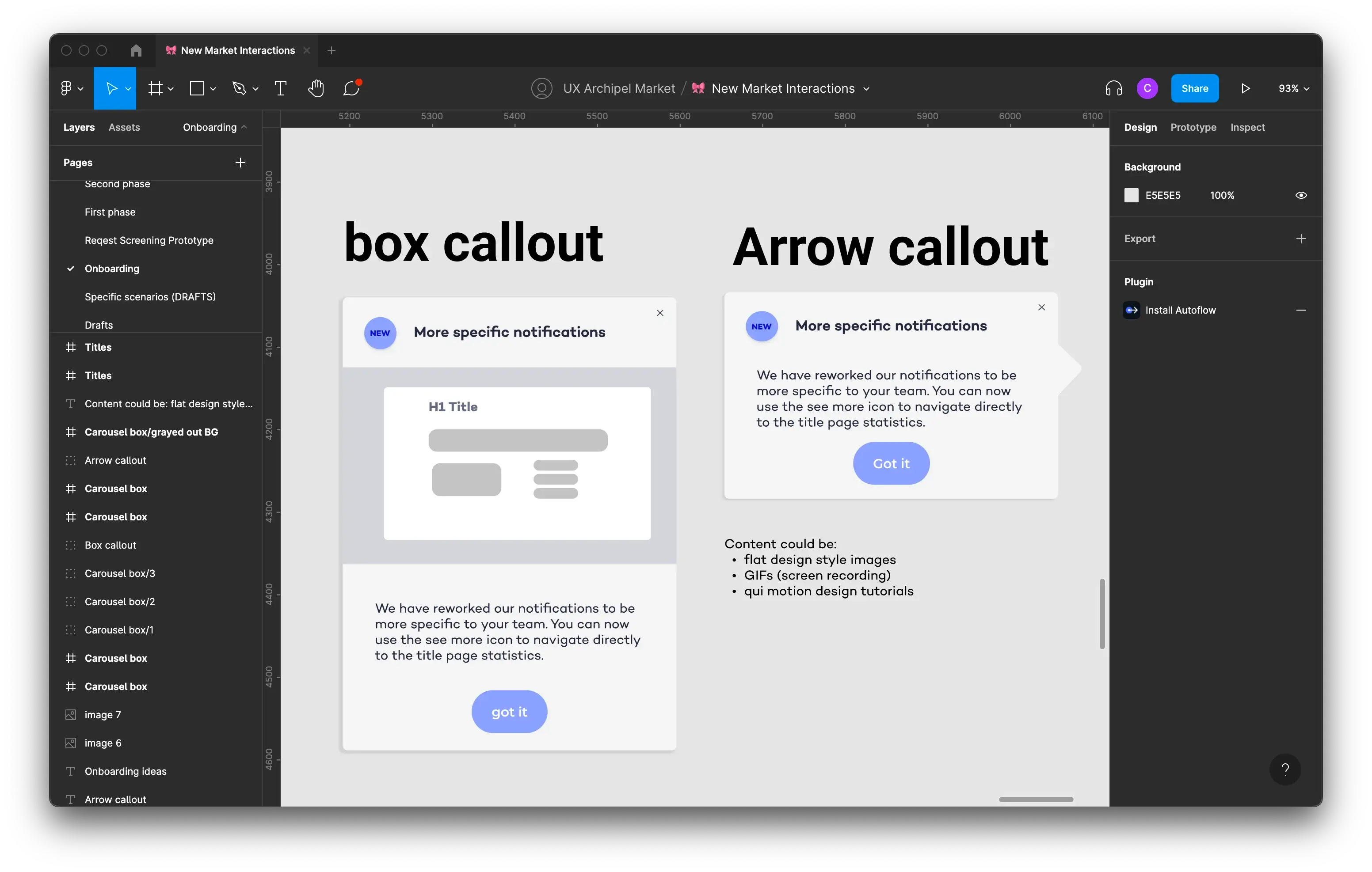
The two main types of callouts with a bit more context.
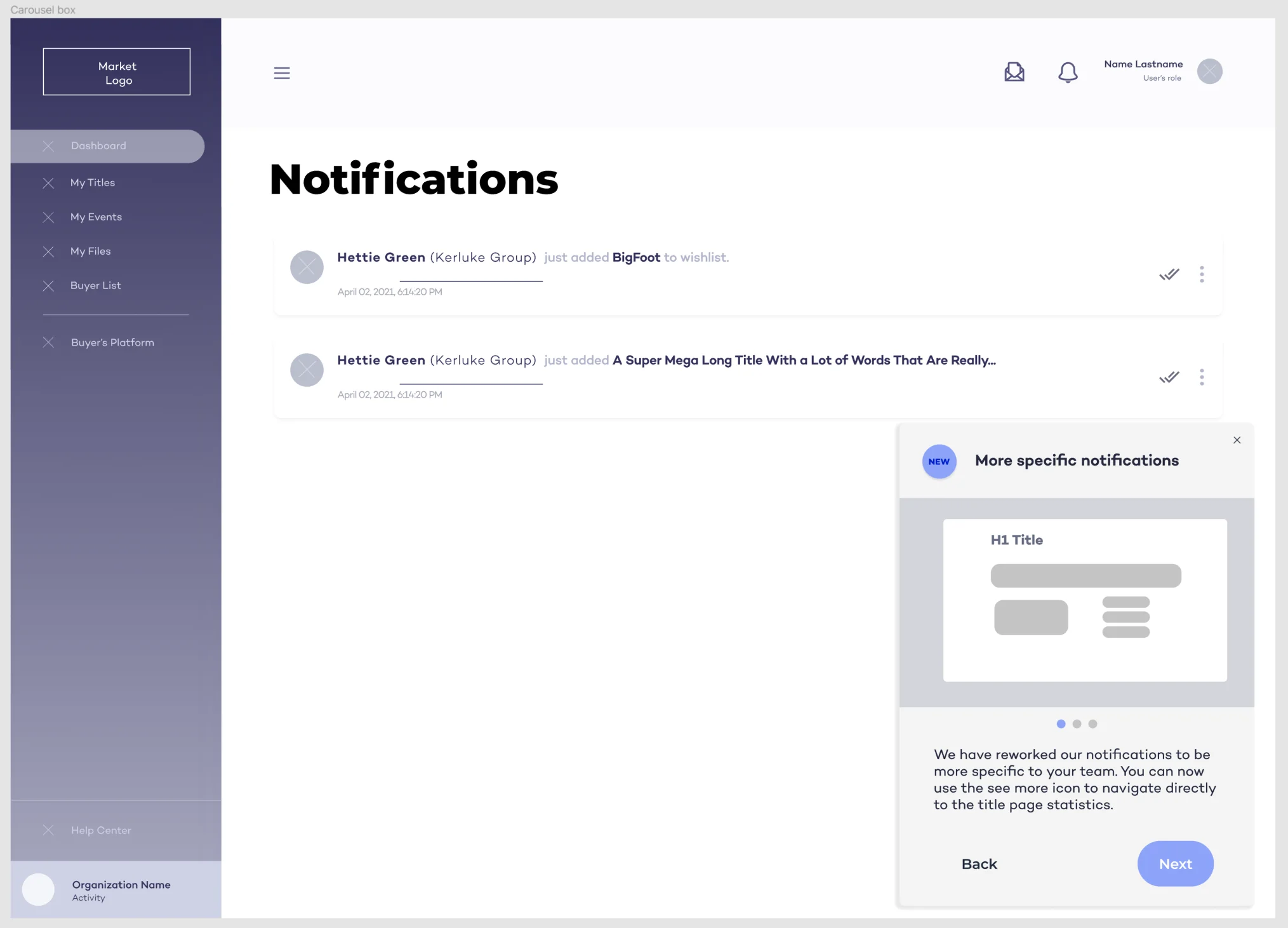
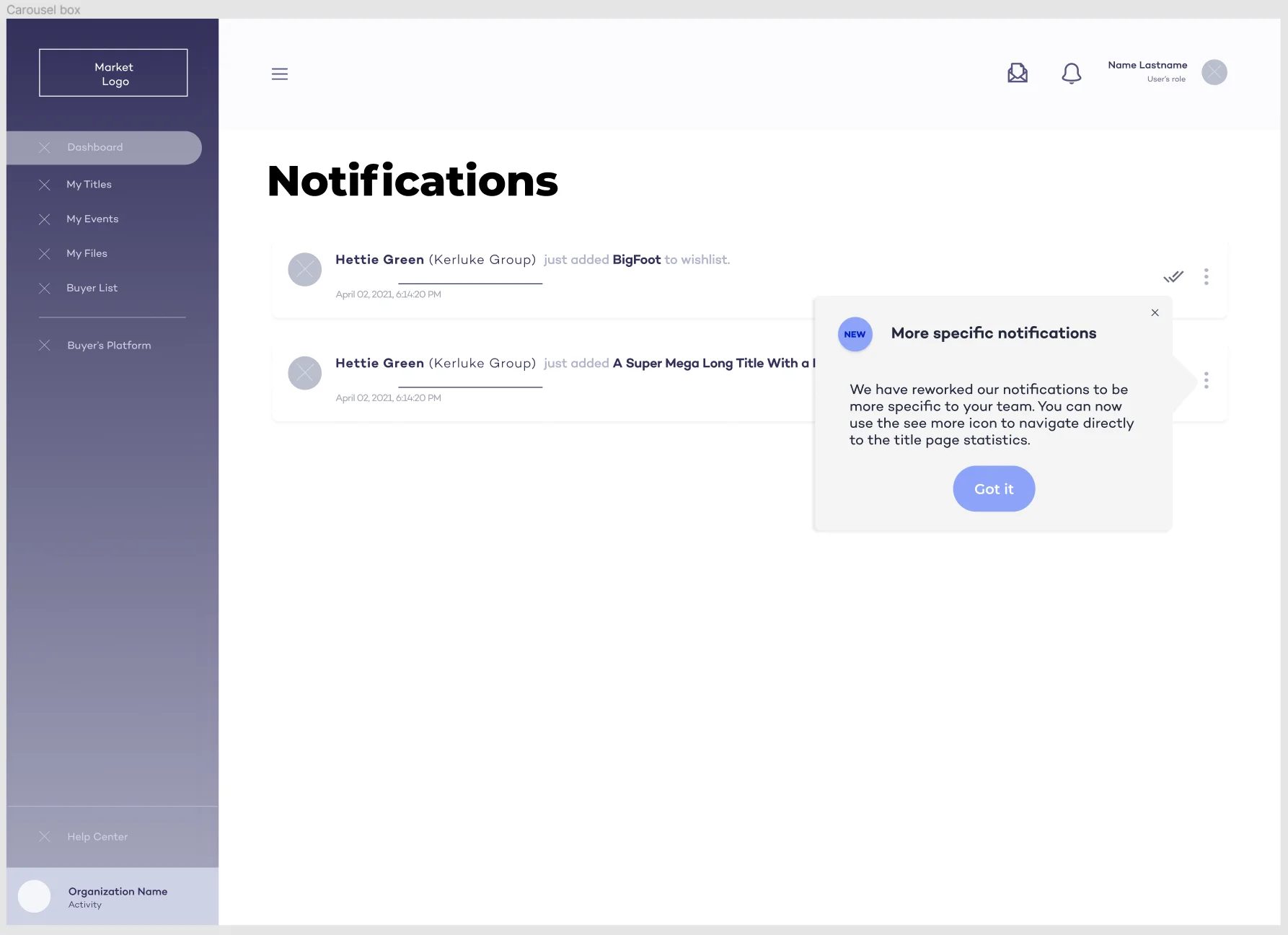
Encountered problems
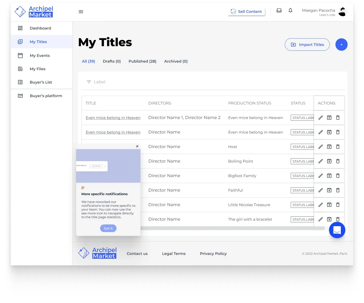
A chat bot already sat at the bottom-right, so I moved the callout to the left side. The contextual “pointer” callouts would take the dev team too much time to implement, so we dropped that idea in favour of the fixed-position callouts.
UI adaptation
After a final meeting with the lead developer to confirm there were no further technical restrictions, the wireframes were validated by the project manager and design team, and I had the go-ahead for high-fidelity prototypes.
Experiences through illustration & motion
Sometimes the best way to convey a message is through video and illustration. I had the opportunity to work on motion-design videos as well as full background illustrations.
Landing-page animations
Once the Lead UI designer had drawn up a storyboard, I brought it to life in After Effects, exported it, and optimised it to be as light as possible. After a few iterations, the videos were integrated into the landing page.
Animated & static illustrations
A new page in one of the Archipel web apps needed an animated background to make the experience more pleasant. The rocket illustrations were reworked to be a little more dynamic and fun.
Email-flow illustrations
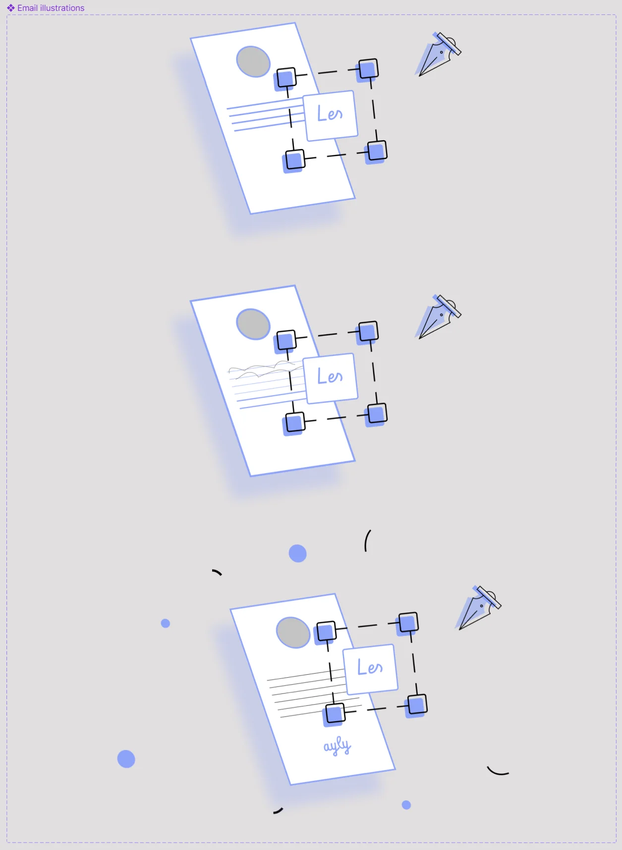
These were for an email flow between clients. There were three types of emails depending on the flow, so I drew up three separate illustrations.